rose schmiedeknecht
home
about
gallery
contact
\ \
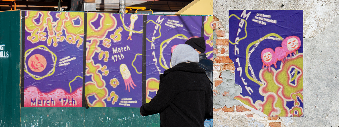
otto benson kinetic posters
overview
A motion-based poster series exploring how typography can communicate tone, atmosphere, and meaning through animation.
- Type: Motion Design, Typography
- Role: Concept, final execution
- Context: Academic project
- Tools: Photoshop, Adobe Illustrator, After Effects
the challenge
Design a moving poster to promote a live music event, using motion and typography to capture attention in a public setting.
Beyond visibility, the challenge was to accurately translate the artist’s identity into motion, ensuring the visual language aligned with the themes and intent behind the music.

- Motion communicates mood
- Form reflects meaning
- Composition evolves over time
concept
This project explores how typography behaves as a living element.
Instead of treating type as static information, the goal was tocreate a system where:
The final direction centers on an organic, human, and an out-of-body-experience, nature-driven aesthetic, inspired by the themes of the album being performed.
process
- Geometric forms
- Structured compositions
- Aesthetic influenced by digital systems
1\ Initial Direction
The project began with a more technological approach:
However, deeper research into the artist revealed a disconnect—particularly their resistance to technology and its emotional impact.
- From rigid → organic
- From geometric → rounded, fluid forms
- From digital precision → human imperfection
2\ Concept Shift
This insight prompted a full pivot:
This shift became the defining moment of the project, aligning the design more closely with the artist’s values and the emotionaltone of the work.
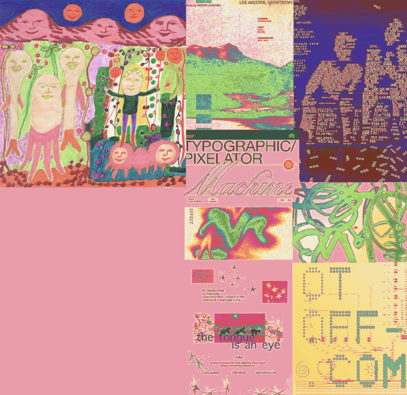
mood board
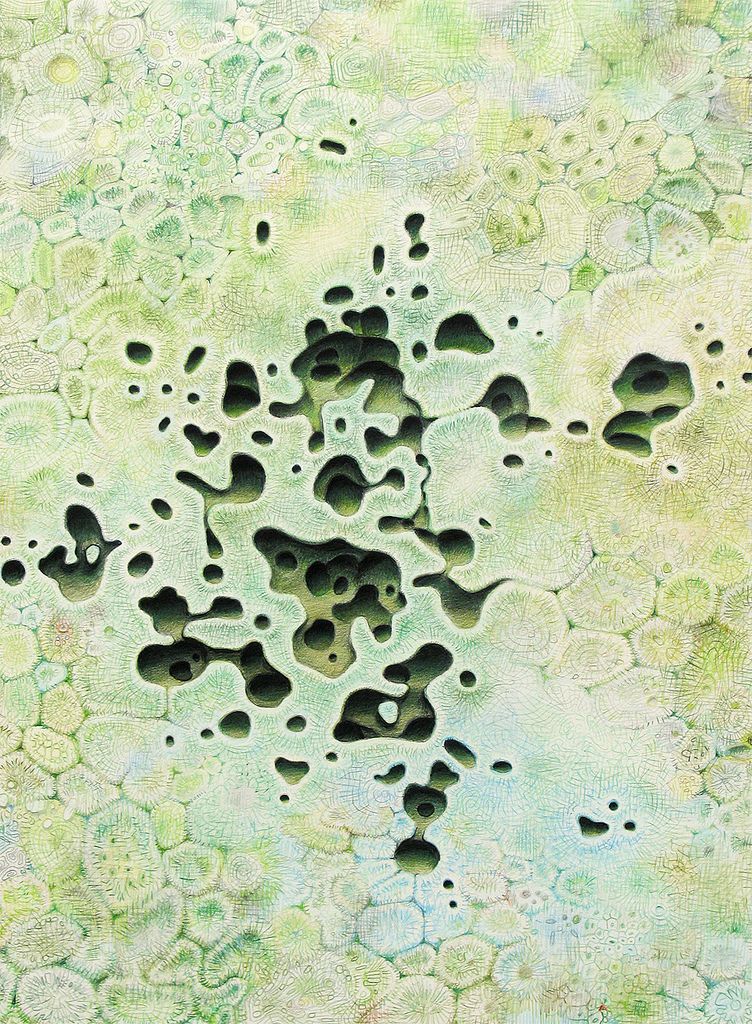
The visual direction was shaped through a mood board combining experimental typography, glowing gradients, hand-drawn textures, and surreal organic imagery.Early inspirations leaned more digital and geometric, but deeper research into the artist’s views on technology led to a major conceptual shift toward softer, more human visuals.
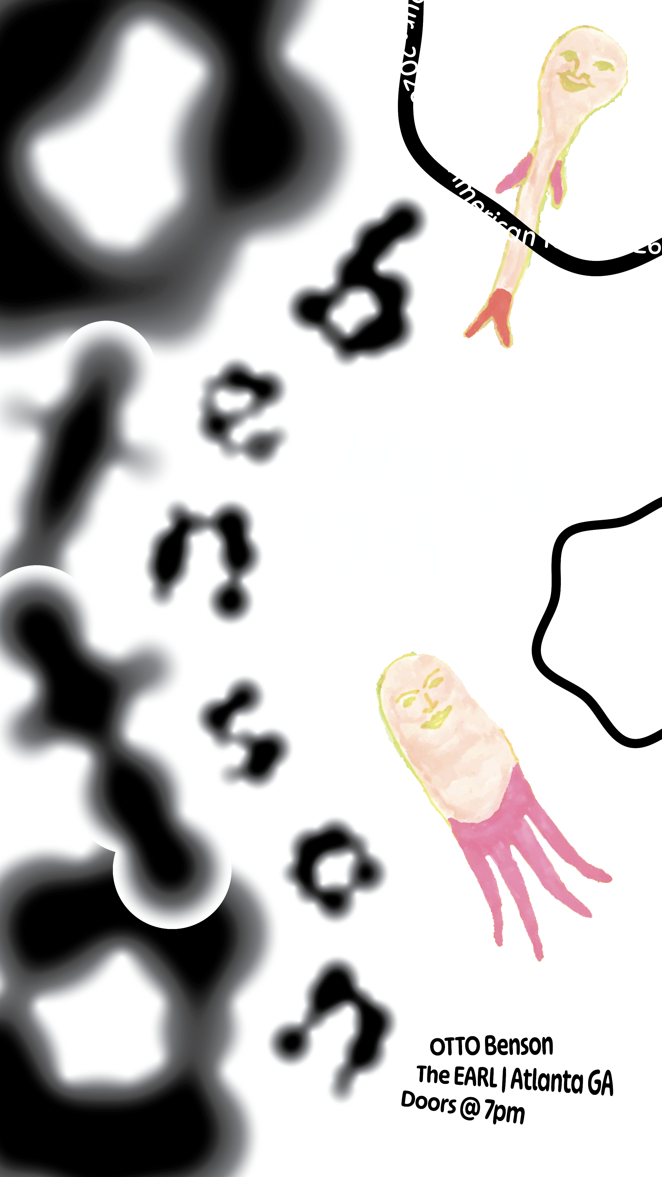
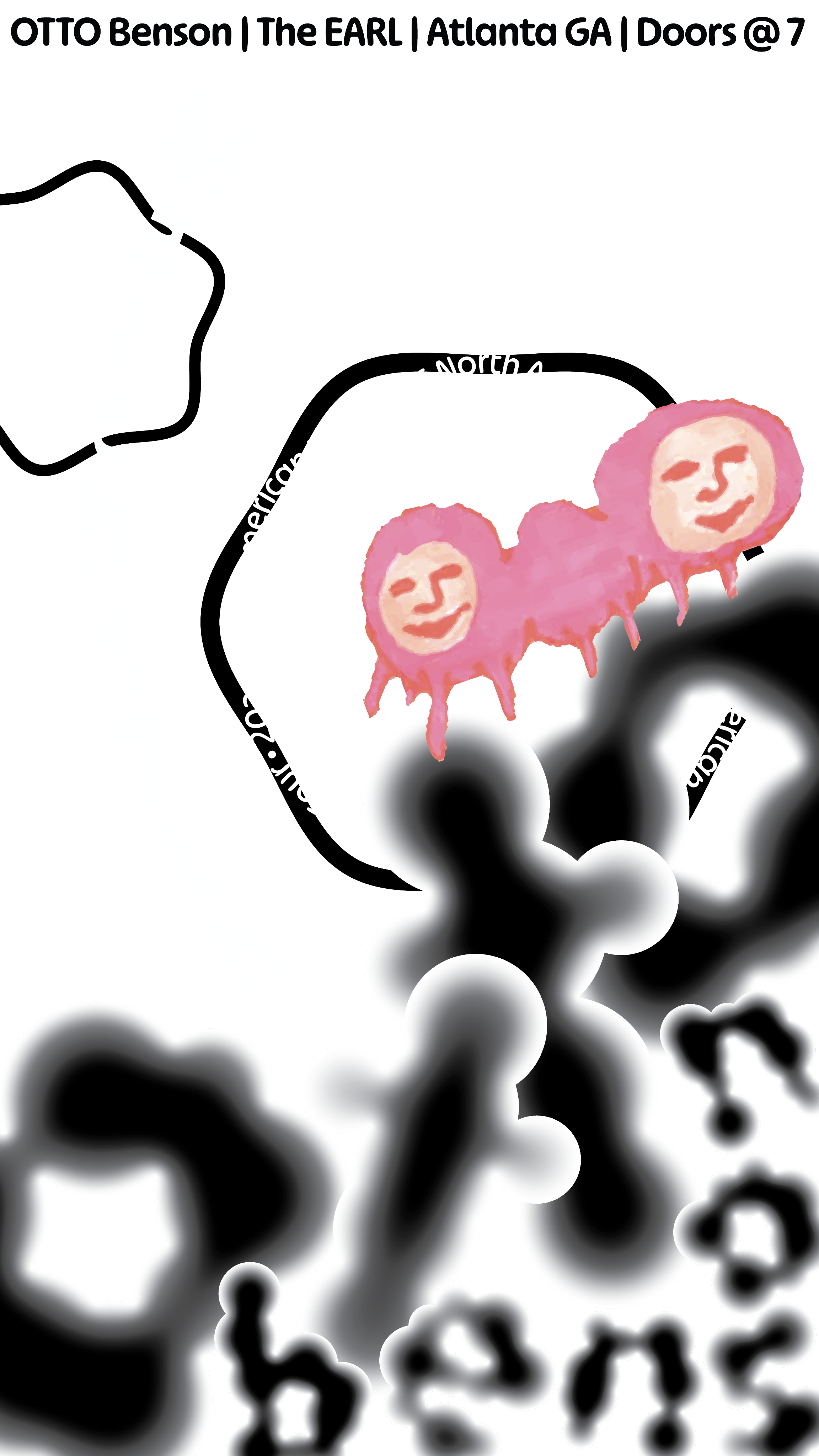
iterations
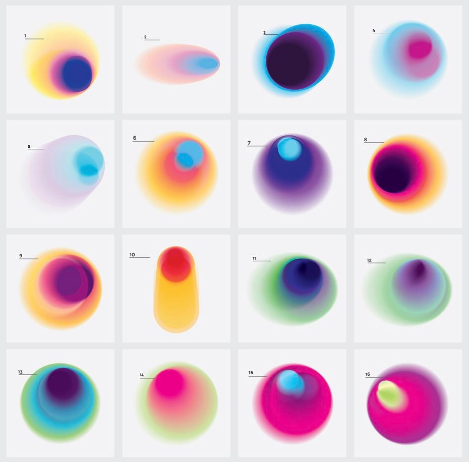
The project went through multiple rounds of experimentation exploring typography treatments, composition, and visual balance.I worked in black and white, focusing on the composition, occasionally using the gradient map feature in Photoshop to test color variations while keeping values consistent.
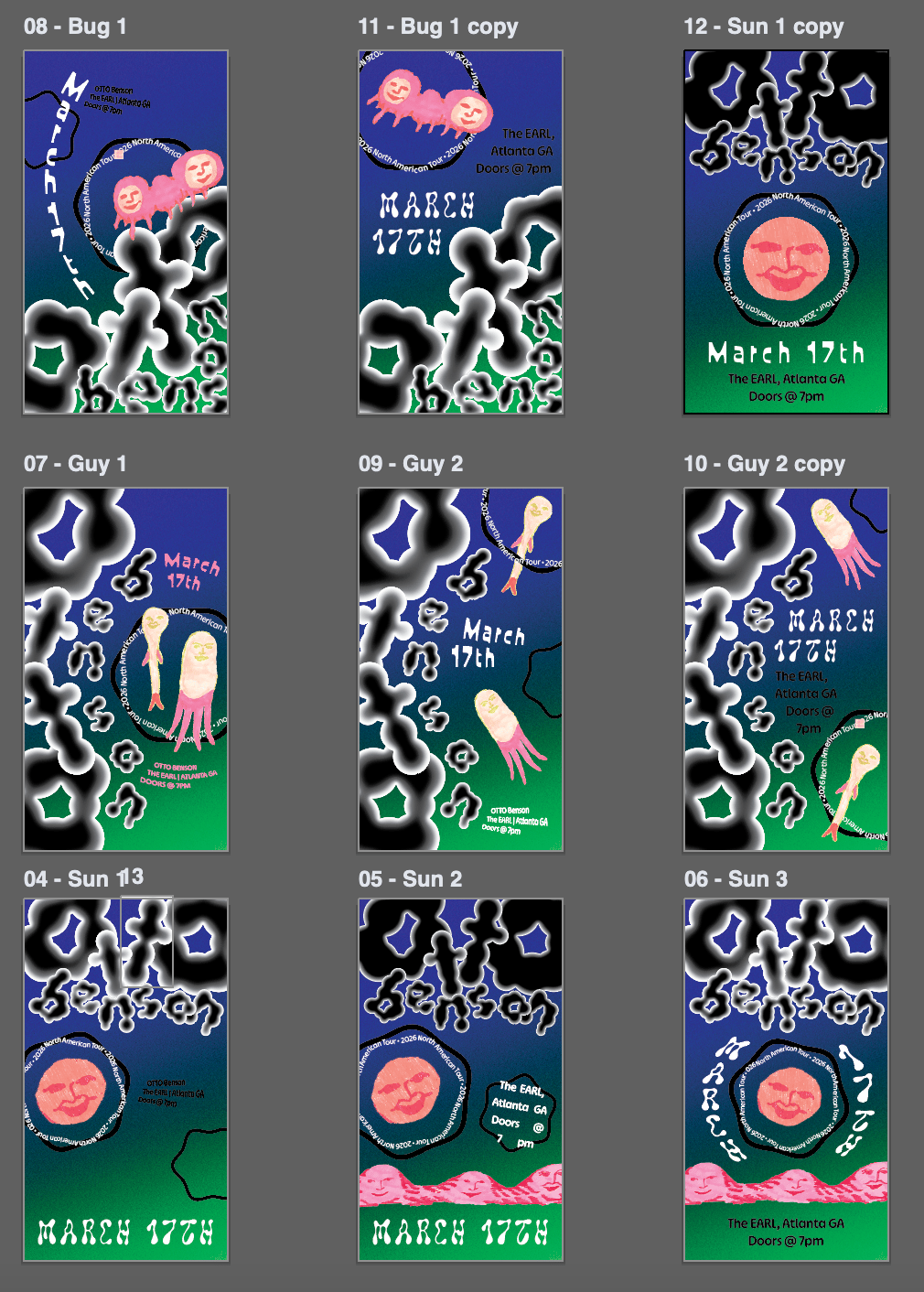
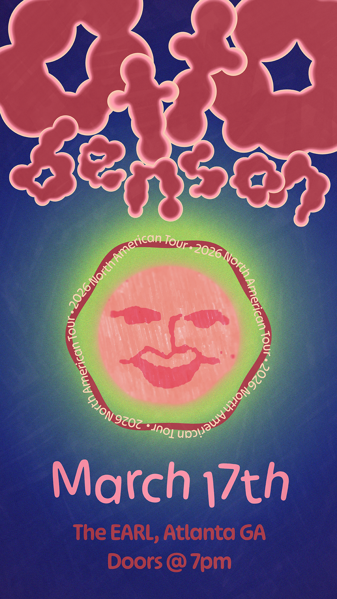
- A custom, hand-drawn title treatmentestablishes a distinct visual identity
- A consistent color palette is derivedfrom the album artwork
- Rounded, organic forms reinforcethe conceptual direction
- Motion is slow, floating, and continuous,emphasizing a sense of calm and connection
design system
To maintain cohesion across motion and composition:
Across the series, each poster shares the same foundation but introduces variation through composition and movement.
- Slow, drifting movement(“floating” as a guiding principle)
- Elements shift and reconfigure ratherthan abruptly change
- Posters transition into one another, creating a continuous visual flow
motion approach
The animation is intentionally restrained and atmospheric:
This approach prioritizes mood over speed, encouraging viewers to engage more deeply with the piece.
reflection
This project strengthened my ability to translate abstract concepts into motion and reinforced the importance of aligning visual direction with deeper research.
I was particularly challenged by balancing expressive typography with readability, especially within a dynamic composition. Iteration played a key role in refining that balance.
If expanded further, I would explore additional motion variations and test the work in real-world display contexts to better understand how pacing and visibility function in public spaces.
final outcome
The final result is a 35-second animated sequence of three interconnected posters, designed for digital displayin public environments.
Each composition stands on its own while contributing to a larger, evolving system—balancing consistency with variation.