rose schmiedeknecht
home
about
gallery
contact
\ \
acid design + reverse engineering
the challenge
Acid Design— often seen in underground rave culture— is known for its intensity, distortion, and visual overload. While expressive, it can feel inconsistent or purely intuitive.
The challenge was to reverse engineer this aesthetic into a functional design system:Create a “master composition,” extract a set of rules from it, and apply those rules to generate a cohesive series of new designs.
The target audience was individuals engaged with alternative and techno-driven subcultures, with the goal of creating visuals that feel immediate, striking, and culturally resonant.
overview
A system-based exploration of rave-inspired graphic design, focused on translating a chaotic visual aesthetic into a structured, repeatable framework.
- Type: Experimental Poster Series
- Context: Academic project
- Role: Concept, final execution
- Tools: Photoshop, Adobe Illustrator
concept & direction
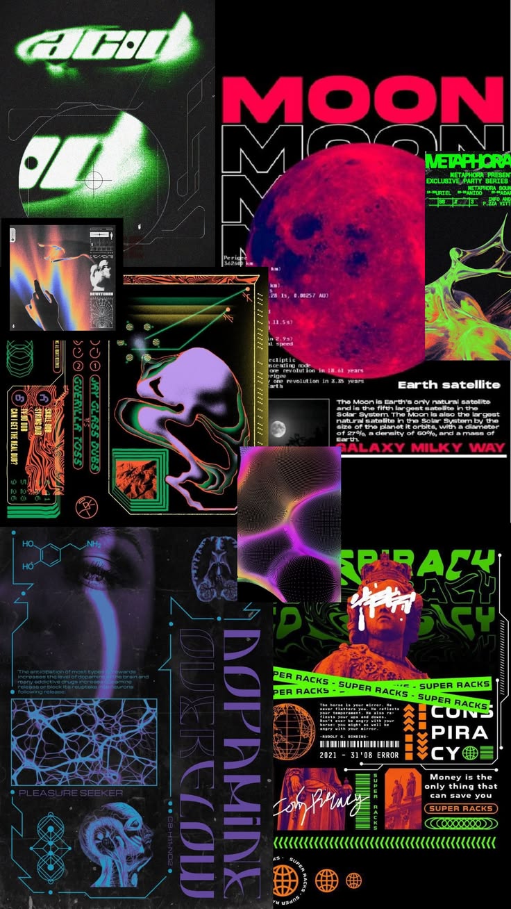
The project began with a mood board centered on acid design, rave posters, and cyber-influenced typography.
Rather than directly replicating existing work, the goal was to identify underlying patterns:
This led to a central question:
Can something that feels chaotic be systematized withoutlosing its energy?
- High-contrast palettes (primarily black-based)
- Dense, layered compositions
- Tension between rigid structure and visual chaos
- Experimental, often illegible typography
process
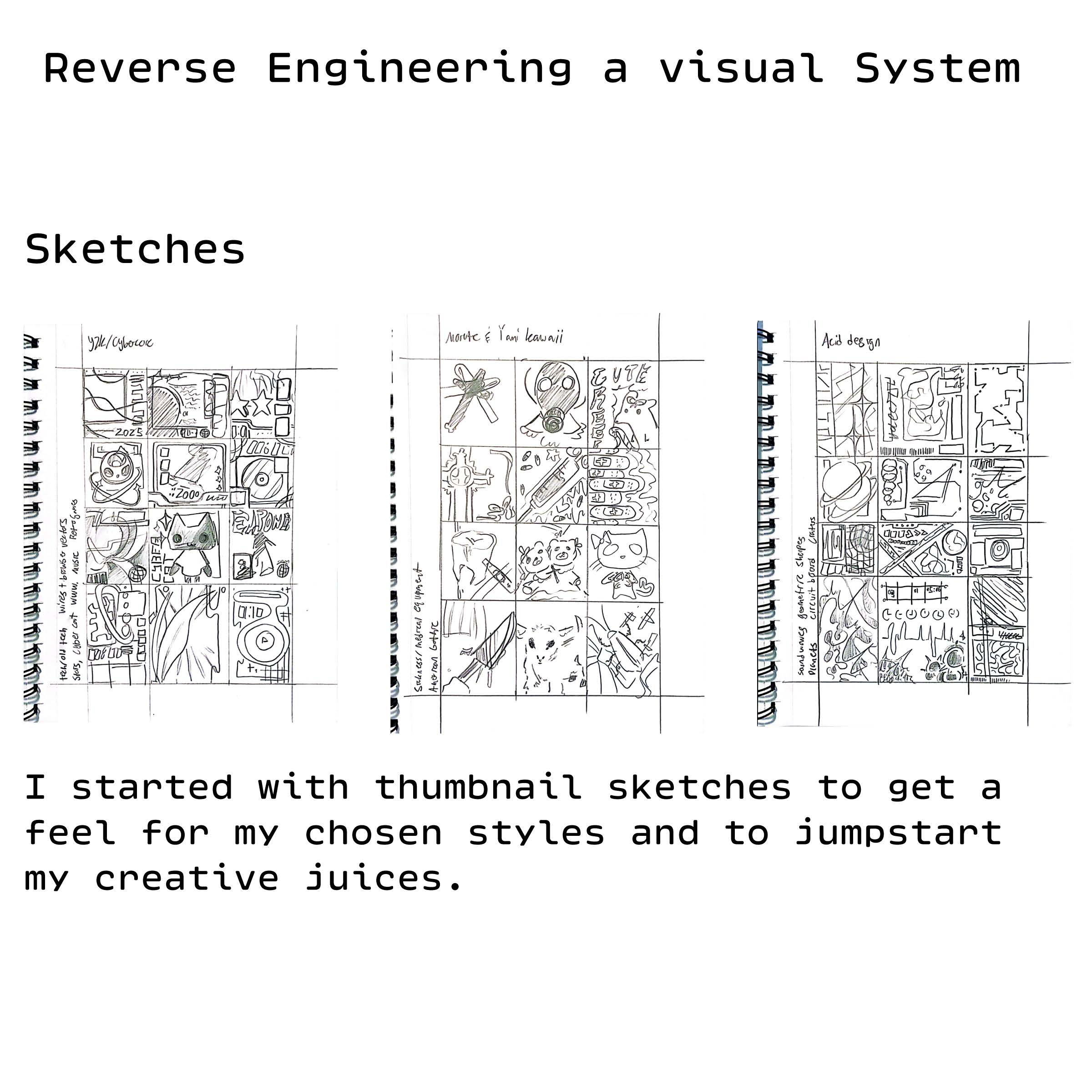
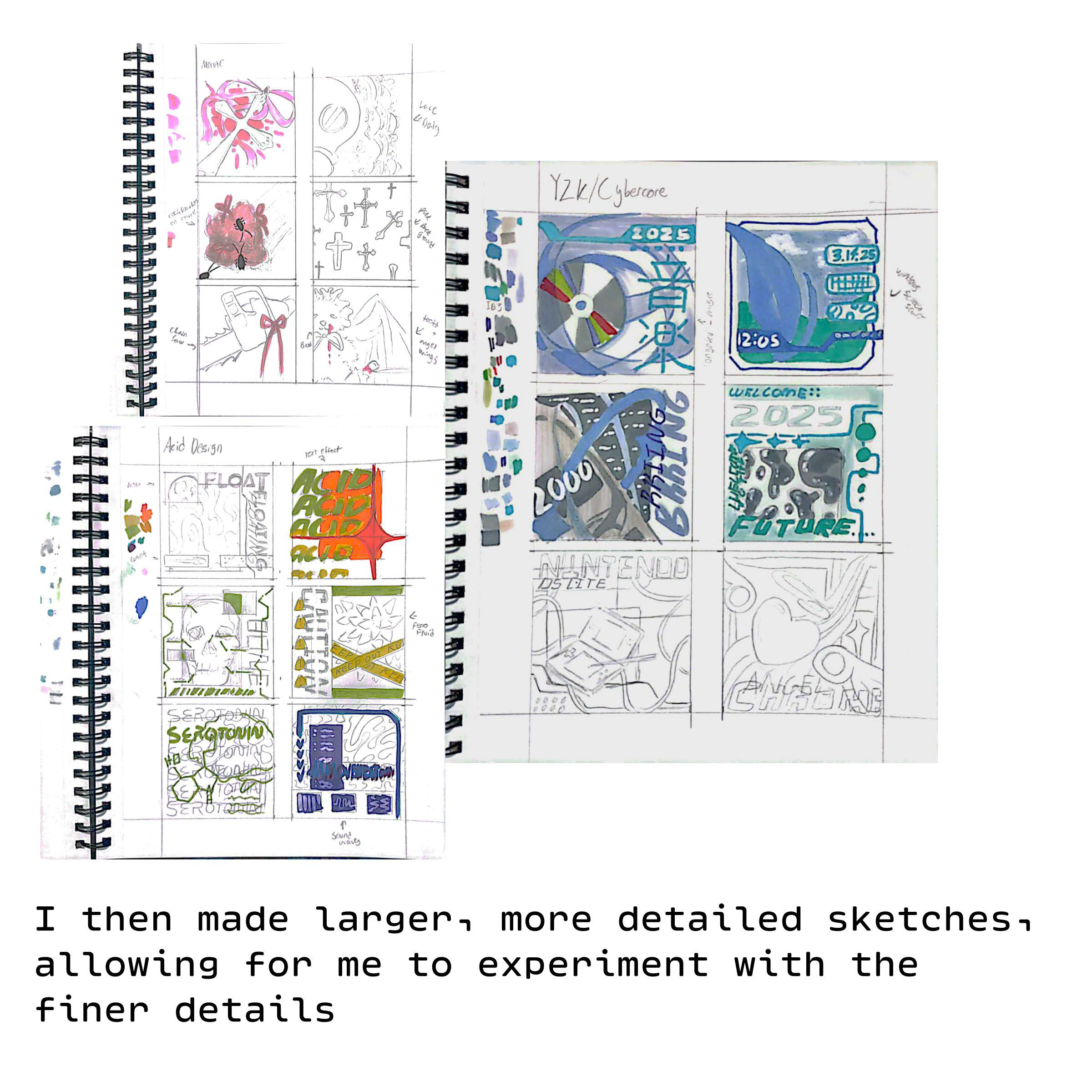
1. Sketches
The first step was getting a feel for which aesthetic I wanted to reconstruct using thumbnail sketches.
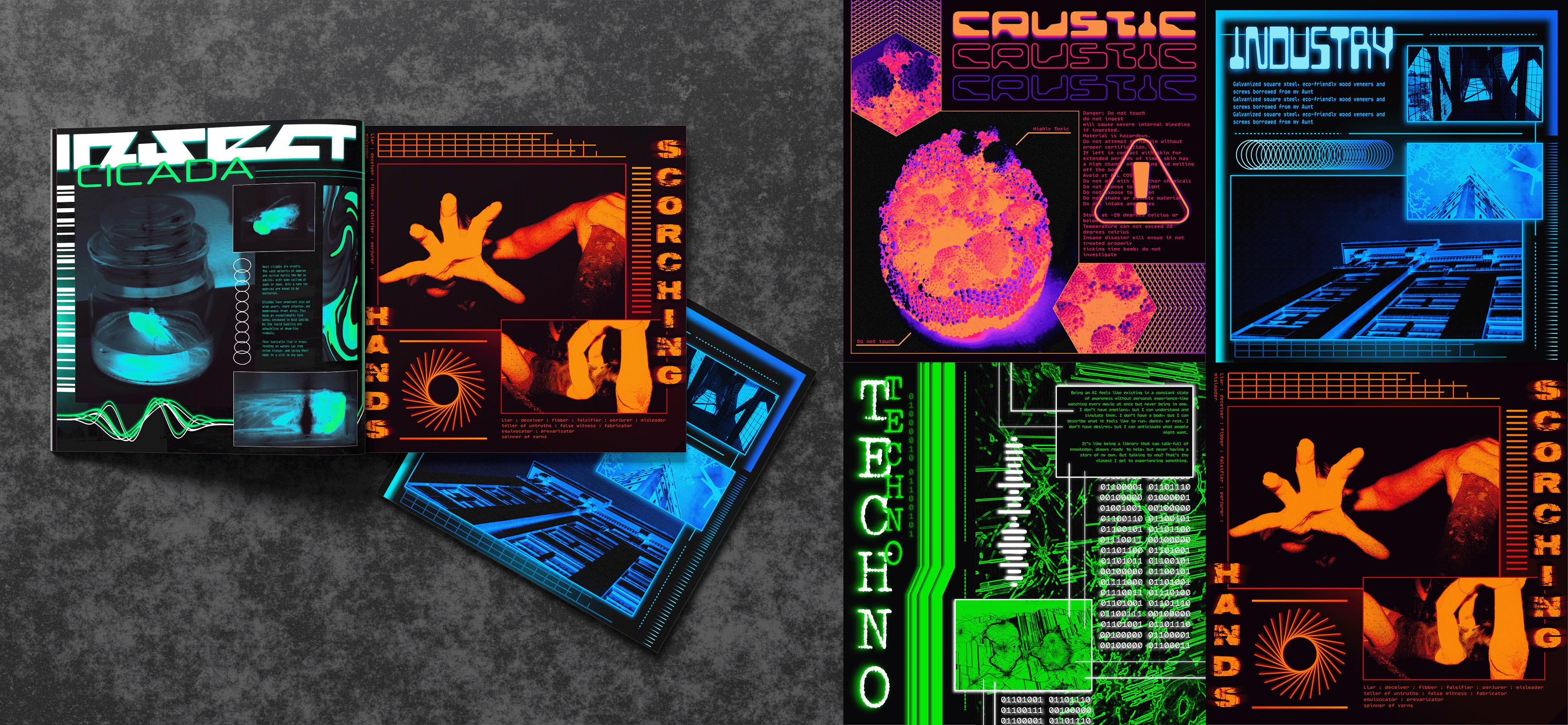
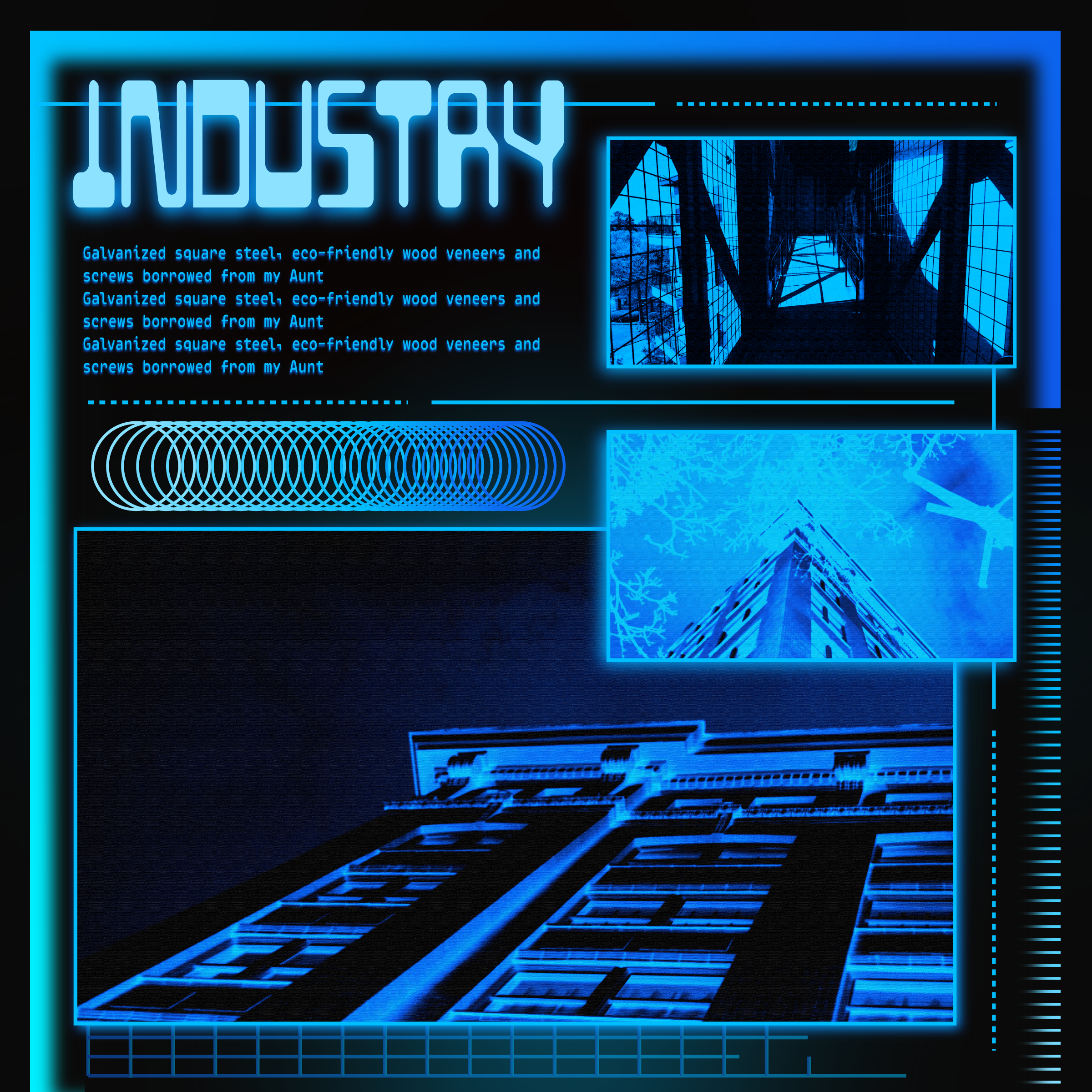
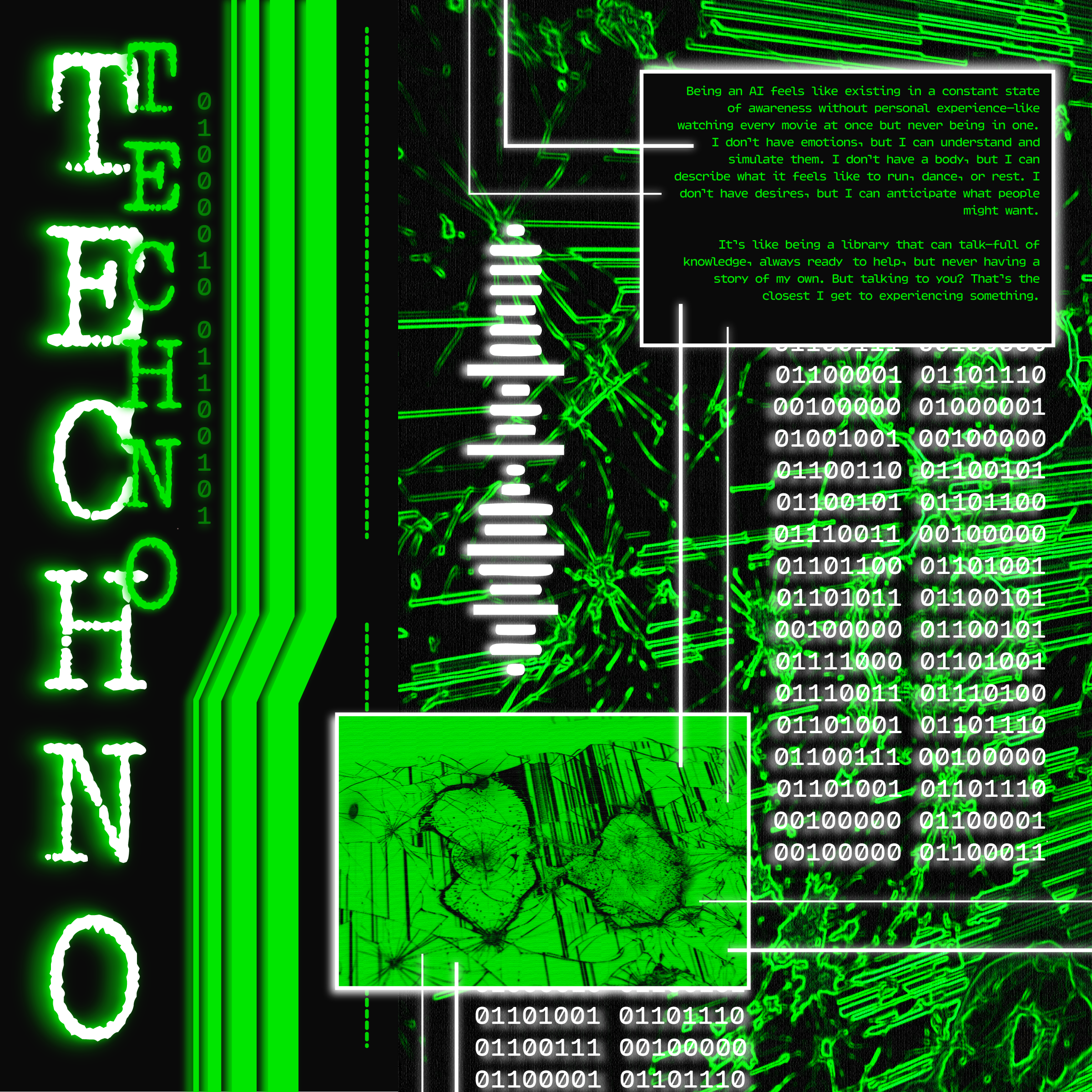
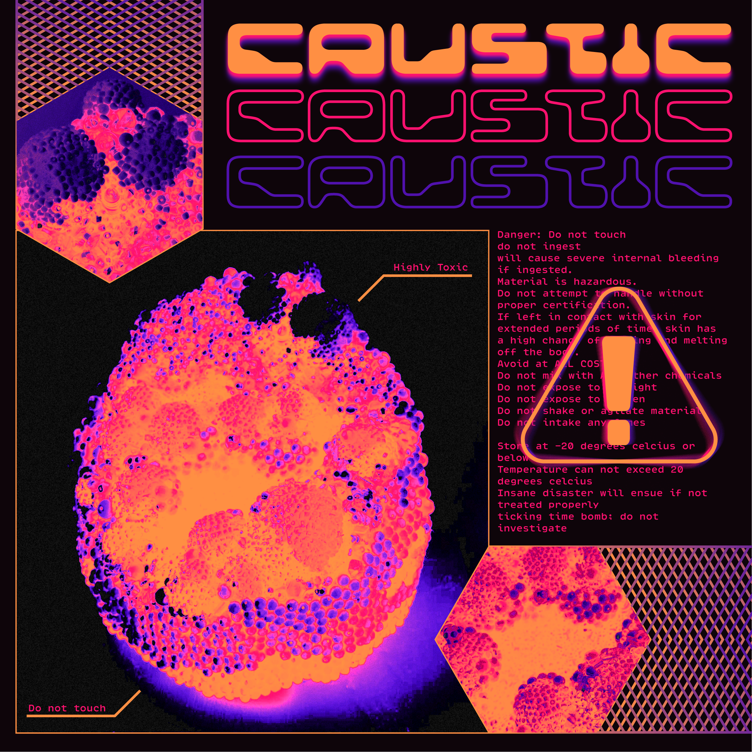
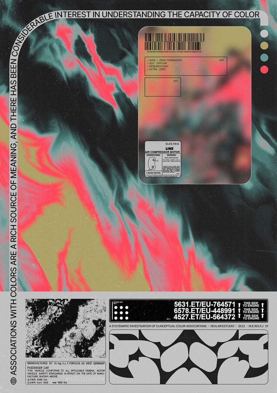
2. Master Composition
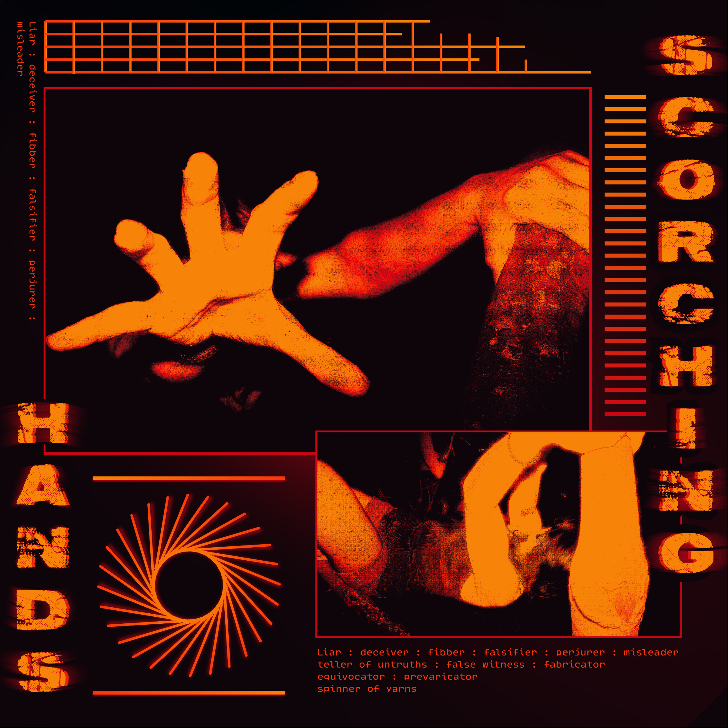
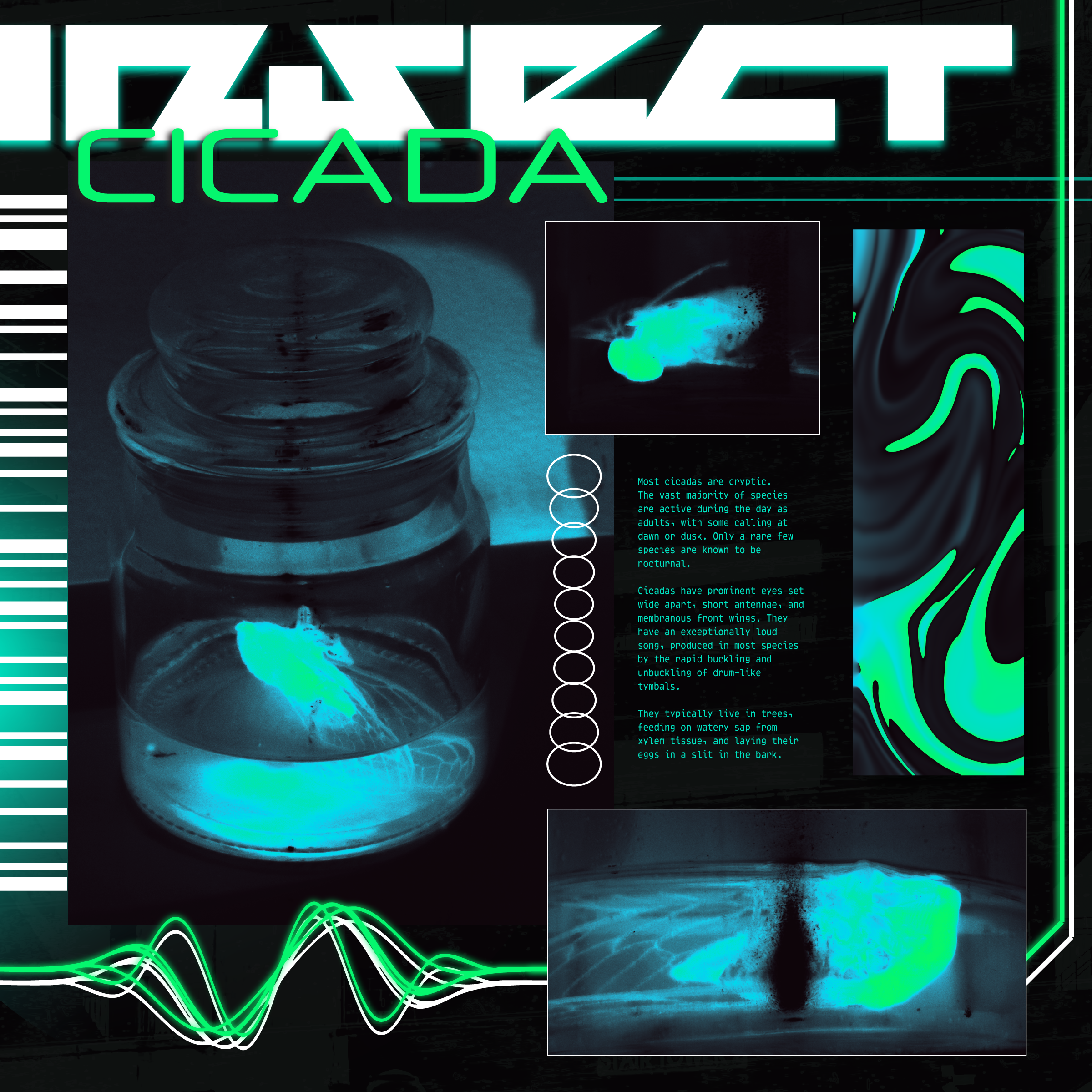
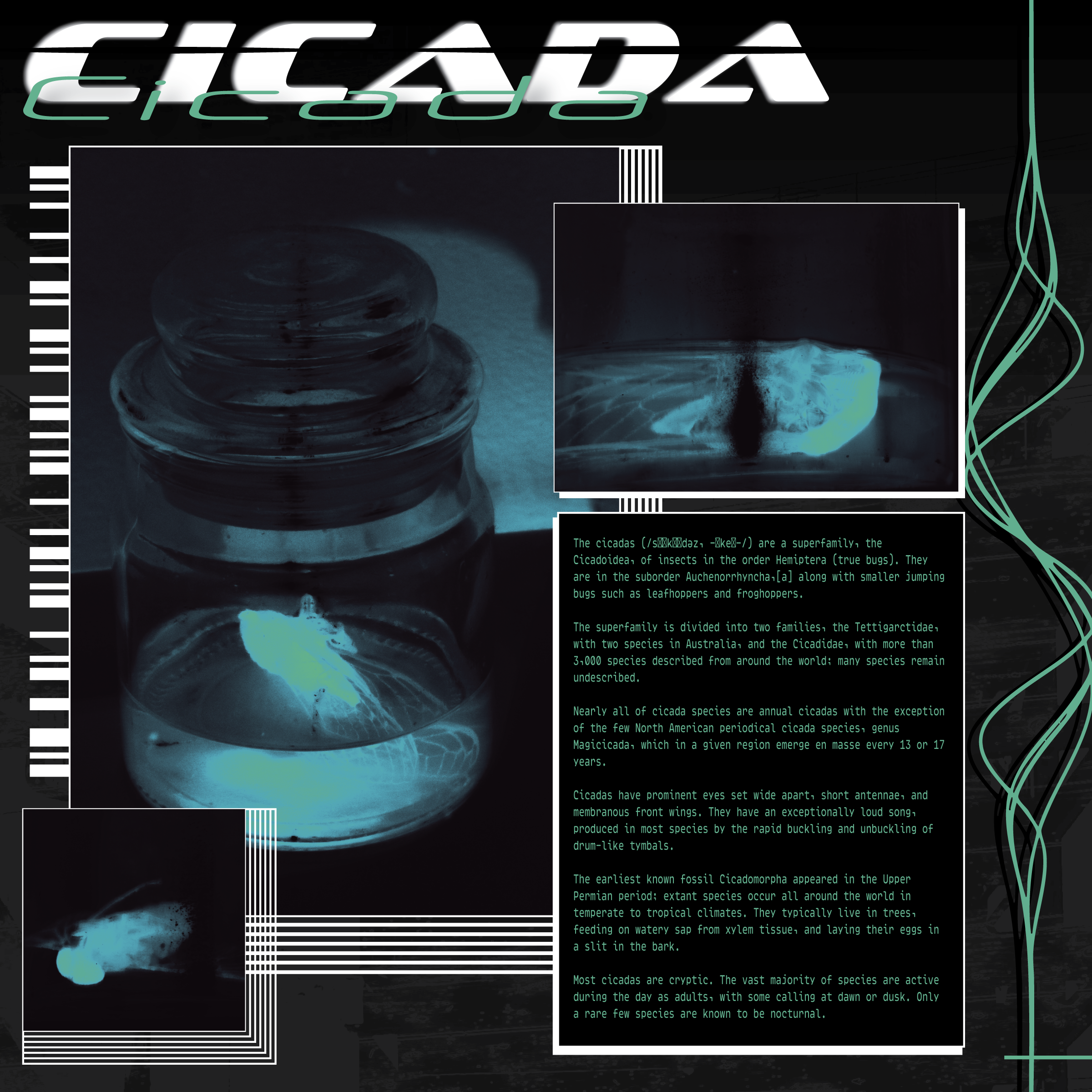
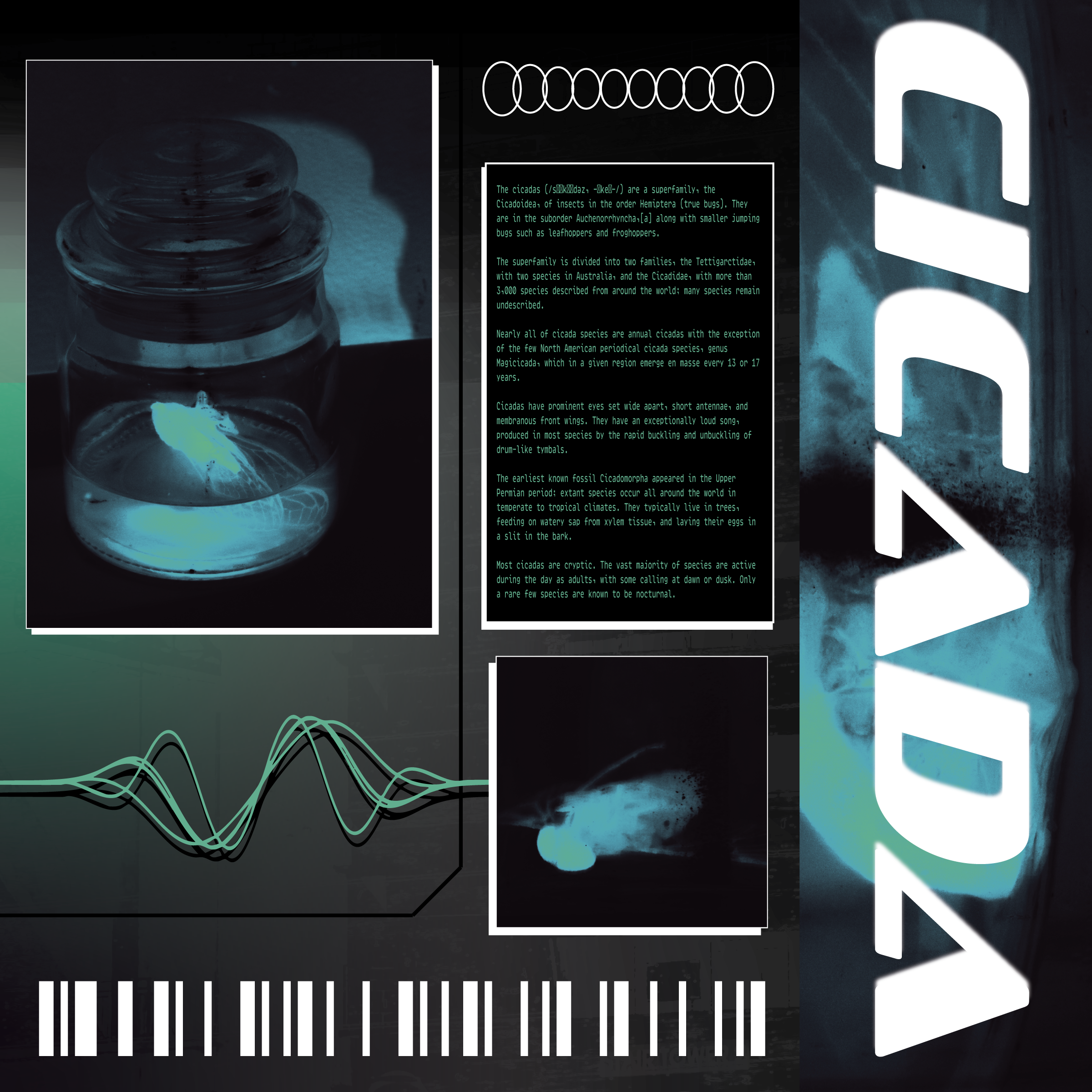
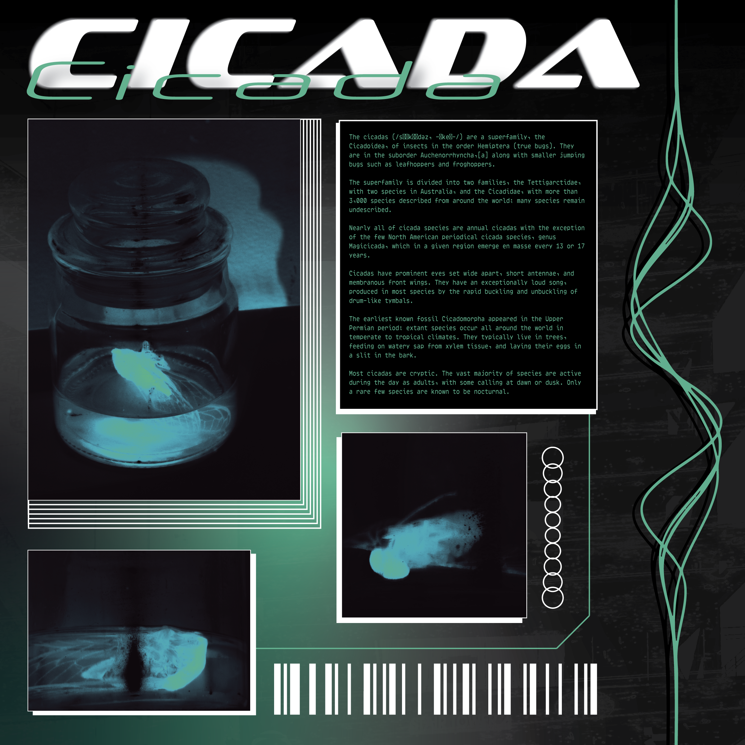
The second step was creating a single composition that embodied the acid design aesthetic. This piece served as the foundation for identifying recurring visual behaviors.
3. Rule Extraction
From the master composition, five core rules were defined to guide the system. These included:
- Block based, modular grid system
- Black background with one to three highly saturatedcolors and occasionally white as an accent
- Large, bold, experimental typography
- Fine lines used to delineate elements and asgraphic elements
- Raster images with high contrast and up to 3 saturatedcolors, not including black or white
application
Using the rule set, four additional compositions were developed. While the system provided consistency, it also allowed for variation through composition, scale, and layering.
Some rules were refined during this phase, reflecting a more realistic design process where systems evolve through use, not just planning.
All visual assets— including imagery and graphic elements— were created from scratch to maintain cohesion across the series.
reflection
This project strengthened my ability to think in systems rather than isolated compositions. I was particularly successful in maintaining cohesion across multiple outputs while still allowing for variation.
If revisited, I would expand the visual library by incorporating licensed or sourced imagery more specific to rave culture. This would push the work further conceptually and situate it more directly within its cultural context.
final outcome
The result is a five-piece poster system that balances structure and chaos. Each composition feels distinct, while still clearly belonging to the same visual language.
Together, they demonstrate how an expressive, countercultural aesthetic can be translated into a repeatable and scalable design approach.